Color Concept
Color and Accessibility
Color, like images, can add visual appeal to your web pages or documents and draw attention to important information. In order for color to work, however, it needs to be perceivable. Poor color choices can affect individuals who are visually impaired or color blind.
Contrast
Having sufficient contrast between the foreground text information and background color is necessary to be able to perceive the information. Text content that is not distinguishable from the background color can prevent not only individuals with visual impairments or low contrast sensitivity from reading the information, but also those trying to view content in sunlight or in glare conditions.
When choosing colors to present text information in web pages or electronic documents, the foreground to background contrast ratio should be a minimum of:
- 4.5:1 for regular text
- 3:1 for 18 point font and larger, or 14 point font and bold
In general, pastel colors or the “light” version of a particular color do not provide sufficient contrast against a white or dark background.
In the following example, the yellow welcome text is superimposed over a aqua colored background representing an ocean wave. The color and thin font used for the text makes it difficult to perceive the information.

Selecting a different font color as well as changing the background of the text can result in a more visually discernible welcome banner.

The contrast ratio is evaluated by comparing the foreground and background color choices. A contrast ratio may be tested using the following tools:
Color & Meaning
Color should not be used as the sole means of providing information. Individuals who are blind, visually impaired, or have certain types of color-blindness may not be able to perceive what information is being communicated by color alone.
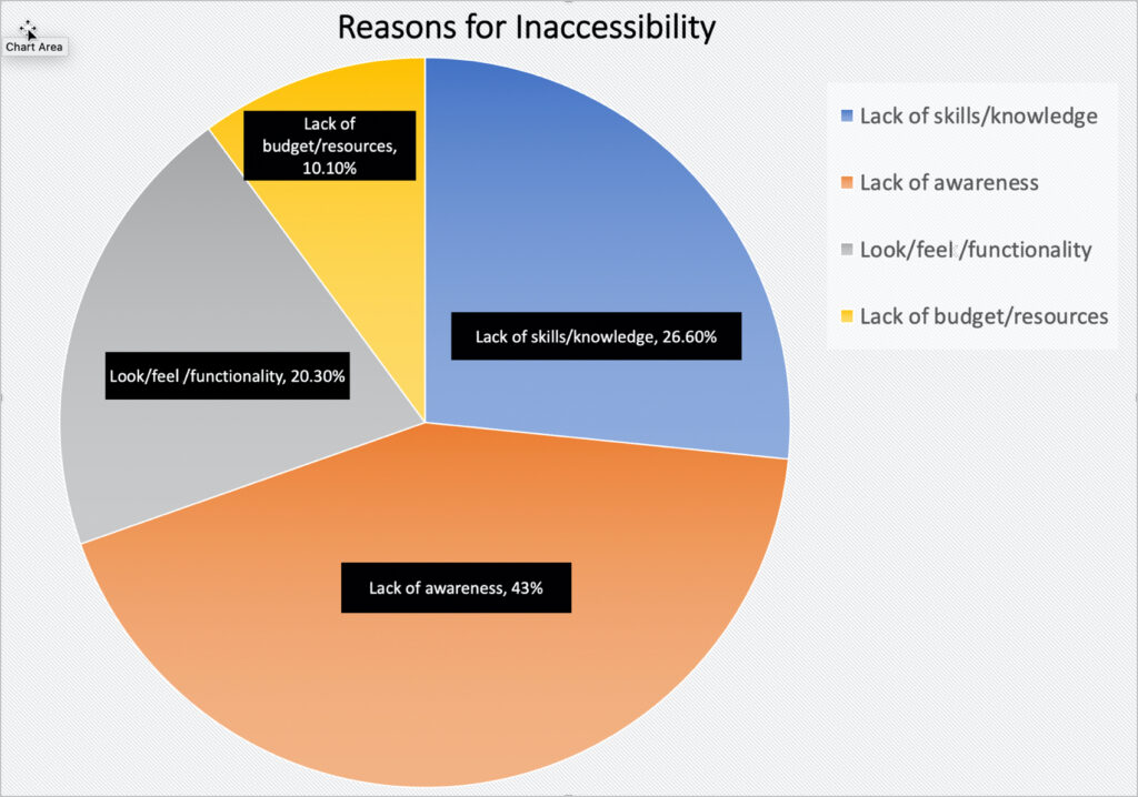
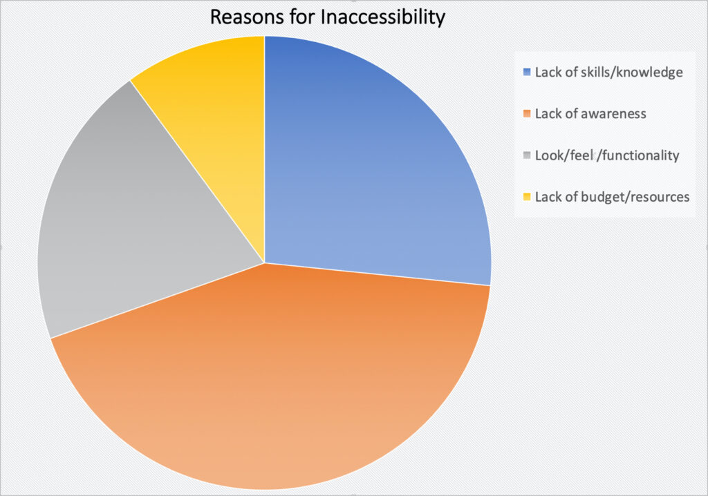
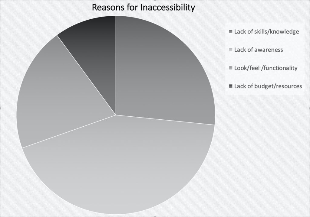
For example, the charts below show the reported reasons for inaccessible web page design. Without any additional information, it can be difficult to understand the categories.
However, with inclusion of additional information, along with the use of color, everyone can better understand how the information is organized on the pie chart.
This inaccessible pie chart lacks labelled data and forces users to rely on interpreting the colors based on the legend.
This inaccessible pie chart uses greyscale, further reducing the contrast between the slices.
This accessible pie chart provides detailed labels that include the data value and the category name on the chart in conjunction with a legend.