Structure Concept

Headings & Structure

Take a quick look at the newspapers in the image below. At a quick glance, even with a small image, you can easily ascertain the title of the newspaper, the titles of articles, and the “lead” story. Newspapers are great examples of the ways formatting text can aid readers.

Examples of various newspapers with different for headings.

Headings

Organizing content prevents cognitive overload, providing information in digestible pieces for your students. Headings are valuable in presenting the main points of a section, by providing a logical structure for information, or allowing visitors to skim the contents.

From an accessibility perspective, headings provide individuals using screen readers with a simple method to navigate within a page or a document. A recent WebAIM survey of screen-reader users found that using headings remains the predominant method for finding web page information and that over 80% of respondents found headings very useful or somewhat useful when navigating content. The use of headings allows individuals to move and find information in a more efficient manner.

Heading Styles

Heading 2 is larger than Heading 3. Heading 3 is larger than Heading 4.

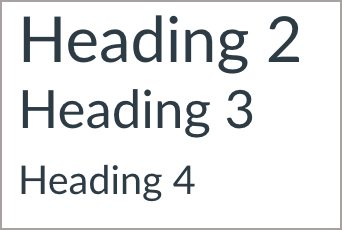
Here we see Heading 2, Heading 3, and Heading 4.

Using different heading styles along with changes in the font size can help individuals perceive the content, organize the information into meaningful sections, and understand how the subtopics relate to the main topics, and with one another:

  • Heading 1 is the main topic or title of the content
  • Heading 2 is used for major subtopics that still relate to the main content
  • Heading 3 and Heading 4 (and more) can be used to further refine the related subtopics

If you are consistent in your heading level structure, users can quickly determine based on text size how the major subtopics (e.g., Heading 2 content) relates to their other subtopics (e.g., Heading 3 and Heading 4 content.)

Common Heading Mistakes 

  • Skipping heading levels. For Example: Choosing a Heading 3 for the main title, followed by a Heading 1, and then a Heading 4.
  • Using the font size, bold, and underline features to create the appearance of a heading instead of programmatically specifying a heading element and then modifying the appearance.

Lists

Lists neatly present related ideas and outlines steps in a process. Bulleted and numbered lists can be used in your documents to format, arrange, and emphasize text. For an individual using assistive technology, such as a screen-reader, the benefit of the list format is that the presence and number of items in that list will be communicated when navigating the content.

Bulleted List 

If your items are a group of equivalent ideas or terms, and the order is not an essential aspect of the concept, use a bulleted list. For example, the following is a list of accessibility practices for electronic documents:

  • Organize material into usable sections
  • Use styles to mark headings for present visually organized pages
  • Integrate meaningful hyperlinks into your text
  • Provide alt text for images

Numbered List

If your items are a sequence or a series of steps, use a numbered list. A numbered list is important when there are specific steps the individual is to perform as part of a process. For instance, the following is a numbered list of steps to take to open a web page:

  1. Turn on the computer
  2. Login to your account
  3. Open the web browser
  4. Enter the address for the web page you want to visit.

Common List Mistakes

  • Creating lists manually using dashes and symbols and not using the list formatting tools
  • Creating a list for a single item. Lists should contain at least two or more list items. However, it is appropriate to use singular bullets when using list styles to organize outlines that contain main points and subpoints. 

Color Concept

Color and Accessibility

Color, like images, can add visual appeal to your web pages or documents and draw attention to important information. In order for color to work, however, it needs to be perceivable. Poor color choices can affect individuals who are visually impaired or color blind. 

Contrast 

Having sufficient contrast between the foreground text information and background color is necessary to be able to perceive the information. Text content that is not distinguishable from the background color can prevent not only individuals with visual impairments or low contrast sensitivity from reading the information, but also those trying to view content in sunlight or in glare conditions.

When choosing colors to present text information in web pages or electronic documents, the foreground to background contrast ratio should be a minimum of:

  • 4.5:1 for regular text
  • 3:1 for 18 point font and larger, or 14 point font and bold

In general, pastel colors or the “light” version of a particular color do not provide sufficient contrast against a white or dark background.

In the following example, the yellow welcome text is superimposed over a aqua colored background representing an ocean wave. The color and thin font used for the text makes it difficult to perceive the information.

Banner lacks sufficient contrast between text and background color.

Selecting a different font color as well as changing the background of the text can result in a more visually discernible welcome banner.

Banner text has contrast between text and background color.

The contrast ratio is evaluated by comparing the foreground and background color choices. A contrast ratio may be tested using the following tools:

Color & Meaning

Color should not be used as the sole means of providing information. Individuals who are blind, visually impaired, or have certain types of color-blindness may not be able to perceive what information is being communicated by color alone.

For example, the charts below show the reported reasons for inaccessible web page design. Without any additional information, it can be difficult to understand the categories.

However, with inclusion of additional information, along with the use of color, everyone can better understand how the information is organized on the pie chart. 

This inaccessible pie chart lacks labelled data and forces users to rely on interpreting the colors based on the legend. 

Pie chart that relies on colors to convey information.

This inaccessible pie chart uses greyscale, further reducing the contrast between the slices.

Pie chart greyscale.

This accessible pie chart provides detailed labels that include the data value and the category name on the chart in conjunction with a legend. 

Pie chart with labels and data values.

Tables Concept

Tables provide a layout structure to organize and present logical relationships. For example, if you had a list of days, a list of appointments on specific days, and a list of specific times for those appointments on specific days, it would make sense to organize the information in a table structure to clearly and accurately present that information.

Using a table simply as an organizational layout structure is not recommended. Instead, it is better to use CSS tools such as a grid, which also creates a more responsive layout structure for different screen sizes/devices. If you’d like to learn more about how to use a grid in Canvas, see MiraCosta faculty member curry mitchell’s page design course for tips.

Tables and Structure

Data tables require specific structural markup to designate the correct column and row header information. By identifying the appropriate column and row headers programmatically, individuals using assistive technology can then navigate and parse the table information in a logical manner.

Column Headers

For data tables that have only column headers across the top of the table, all that is needed is to specify the first row of the table as the headers. For web pages, this can be done by using the <th> element to identify the appropriate table cell as the header.

Column Example

Header <TH>Header <TH>Header <TH>Header <TH>
Data cellData cellData cellData cell

Row Headers

For data tables that have only row headers down the first column of the table, all that is needed is to specify the first cell in each row as the header. For web pages, this can be done by using the <th> element to identify the appropriate table cell as the header.

Row Example

Header <TH>Data cellData cellData cell

Column and Row Headers

For data tables that have both column and row headers, it is necessary to identify both the column and row header cells. For web pages, additional markup is necessary to programmatically define which cells are considered to be header cells for the entire table. This is accomplished by using the scope attribute in conjunction with the <th> elements to define the table headers.

Header <TH>Header <TH>Header <TH>Header <TH>
Header <TH>Data cellData cellData cell

Links Concept

Descriptive Hyperlinks

Hyperlinks that include link text that identifies the purpose or destination of the link can provide important clues that help website visitors choose which links to follow. Using appropriate link text helps website visitors scan for relevant information, identify outside resources, and choose which links are the most relevant for their needs. 

Guidelines for hyperlink text:

  • Identify the purpose or function of the hyperlink as part of the hyperlink name.
  • Be as descriptive as possible without being overly long – a screen reader user will have to listen to the whole link before moving to the next link on the list.
  • Integrate the link into your sentence – sighted users will see the link, and screen readers will hear the link.

Ask yourself when writing a link text, “Will the reader know where they are going just by the link text alone?” 

Inappropriate Link Text

For example:

  1. Click here to read the article.
  2. Read our academic integrity policy read link More Info 
  3. Read Article 1 link (Read More) and Article 2 link (Read More)
  4. Learn more about color and accessibility here and here.

Appropriate Link Text

  1. Read about debunking the myth of voter fraud.
  2. Be sure to read our Academic Integrity Policy.
  3. Read the following: Article 1: The Fall of Man and Article 2: The Rise of Man.
  4. Learn more about color accessibility in terms of contrast and color-coding.

Ambiguous Link Text

Ambiguous link text can be problematic as it does not communicate the purpose or function of the link. Using link text on a web page such as “Click here” or providing the full hyperlink URL does not provide sufficient information as to the purpose or destination of the link.

Some assistive technologies, such as screen readers for blind and visually-impaired individuals, have the capability to scan and present a list of all the hyperlinks on a web page thus allowing that person to quickly jump to the relevant link instead of being forced to listen to the entire page line-by-line.

JAWS Links List window highlighting a non-descriptive link.

This “Links List” functionality can be helpful for someone using such assistive technology, but only if the link text is descriptive. While a sighted person may be able to understand the purpose of the link text “Click here” or “Read more” based on its location and positioning relative to other content on the page, this information is not available for someone who is blind or visually impaired. 

Creating link text that communicates the purpose and/or function of the hyperlink can provide clarity as to the role of that link for all web page visitors.

Images Concept

Images not only provide visual appeal to our pages, but they also convey important information. The old adage, that a picture tells a thousand words, can be very true! The problem occurs when we add an image that provides the content to our students, but fail to provide an adequate text alternative for students who are visually impaired. The alternative text – called alt text for short – feature allows you to provide a description of the image. 

There are times when images not only provide information but also serve a function, such as a button or links to additional resources. In this case, the alt text should communicate the function.

There are scenarios where descriptive alt text is not required and the use of the image is intended as visual decoration only. In this case, alt text is not necessary as the image has no real content value. Many images, however, have a pedagogical purpose, and , therefore , require descriptions explaining the information the images conveys. 

General rules for alt text

When thinking of an appropriate text description, the alt text should be: 

  • Accurate: including spelling, grammar, and proper punctuation.
  • Concise: using the fewest words possible while providing a meaningful description for the image.
  • Equivalent: presenting the same content and/or function of the image.

Ask yourself when writing an alt text, “If you have to describe it over the phone, what would you have said?”

Common Mistakes

  • Stating “image of”, “graphic of”, or “picture of” in the alt text field. Assistive technologies will announce if the object is an image, so including this information is redundant and not necessary. If the image medium is an important aspect (such as a photograph or oil painting), then the medium should be included.
  • Adding the file extension, such as .jpg or .png, to the alt text description.

Writing effective alt text practice 

Based on the guidance above, take a moment to think of an alt text for the image below:

John Tenniel’s Mad Tea Party illustration

You may have written, “Alice at the Mad Tea Party with the Hare, Dormouse, and Mad Hatter”. Now, how would the alt text change if this was an art class focused on the illustration style?

The alt text will depend on the context and intention of the image. 

A descriptive alt text may be, “John Tenniel’s cross-hatching illustration style is a linear drawing technique that uses lines to create shadows.”

1 2