
Complex Data & Graphs Concept
Complex Images
Complex images contain substantial information – more than can be conveyed in a short phrase or sentence. These are typically:
- graphs and charts, including flow charts and organizational charts;
- diagrams and illustrations where the page text relies on the user being able to understand the image;
- maps showing locations or other information such as weather systems.
In these cases, a two-part text alternative is required. The first part is the short description to identify the image and, where appropriate, indicate the location of the long description. The second part is the long description – a textual representation of the essential information conveyed by the image. The following examples show different approaches that can be used to provide such short and long descriptions.
Accompanying text (Long Description)
There are situations where the composition of an image is important and needs to be provided in the long description. For example, the sequence of colors used and the relative heights of the columns in a bar chart may be relevant information about the structure of the chart, in addition to the actual values and trends that it depicts.
Remember that complex images can be difficult to understand by many people – in particular people with learning disabilities and people with low vision. Long descriptions benefit many people, and it is good practice to make them available to everyone, for example, as part of the main content. It may also be possible to reduce unnecessary complexity in your images and make them easier to understand for everyone.
It is also good practice to refer to and summarize more complex images from the accompanying text. For example, a reference such as “The following graph shows that visitors were lost in the first quarter, but the numbers recovered in the second quarter” helps to point out the relevant information that the image is intended to present.
Web Accessibility Initiative. (2019, July 27). Complex Images. W3. https://www.w3.org/WAI/tutorials/images/complex/
Example: Description containing structured information
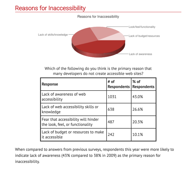
Long description of the pie graph above
Overview
The pie graph shows the various reasons for inaccessibility including in the order of popularity:
- Lack of awareness
- Lack of skills/knowledge
- Look/feel/functionality
- Lack of budget/resources
Which of the following do you think is the primary reason that many developers do not create accessible websites?
Values
Numerical values presented on the image:
| Response | # of Respondents | % of Respondents |
| Lack of awareness of web accessibility | 1031 | 43.0% |
| Lack of web accessibility skills or knowledge | 638 | 26.6% |
| Fear that accessibility will hinder the look, feel, or functionality | 487 | 20.3% |
| Lack of budget or resources to make it accessible | 242 | 10.1% |
Presentation
Write text from the image directly on the Canvas page and add pie graphs and charts. See Accessible Version of Reasons for Inaccessibility to review example on a Canvas page.